반응형
material-ui 를 사용하여 컴포넌트를 개발하던 중 Backdrop 이 없는 움직이는 다이얼로그 창이 필요했다.
material 에서 제공해주는 컴포넌트 중 Draggable dialog 가 있었지만, 내가 필요한 것은 Backdrop 이 없으며 이동가능해야하고, 리사이즈 기능까지 있어야 했다. 그래서 나는 material 컴포넌트의 일부와 모달 드래그 및 리사이즈 라이브러리(react-draggable, react-resizable) 를 사용하여 컴포넌트를 구성하였다.
먼저 필요한 라이브러리를 설치한다.
//npm
$ npm i --save @material-ui/core @material-ui/icons react-draggable react-resizable prop-types

// yarn
$ yarn add @material-ui/core @material-ui/icons react-draggable react-resizable prop-types
DraggableResizeModal 컴포넌트 생성한다.
import React, { useEffect, useState } from 'react';
import {
    Paper,
    makeStyles,
    withStyles,
    IconButton,
    Typography,
    Divider,
} from '@material-ui/core';

import {
    Close as CloseIcon,
    Remove as RemoveIcon,
    WebAsset as WebAssetIcon
} from '@material-ui/icons';

import Draggable from 'react-draggable';
import { ResizableBox } from 'react-resizable';
import PropTypes from "prop-types";

const styles = (theme) => ({
    root: {
        margin: 0,
        padding: theme.spacing(2),
        cursor: 'move',
        userSelect: 'none',
        minWidth: 200
    },
    title: {
        fontWeight: 'bold'
    },
    closeButton: {
        position: 'fixed',
        right: theme.spacing(1),
        top: theme.spacing(1),
        color: theme.palette.grey[500],
    },
    minimize: {
        position: 'fixed',
        right: theme.spacing(6),
        top: theme.spacing(1),
        color: theme.palette.grey[500],
    }
});

// modal 의 타이틀과 최소화 및 닫기버튼 구성
const ModalTitle = withStyles(styles)((props) => {
    const { children, classes, width, isMinimized, onMinimized, onClose, ...other } = props;
    return (
        <div className={classes.root} {...other} style={{width}}>
            <Typography variant="h6" className={classes.title}>{children}</Typography>
            {onClose ? (
                <IconButton aria-label="close" className={classes.closeButton} onClick={onClose}>
                    <CloseIcon />
                </IconButton>
            ) : null}
            {onMinimized ? (
                <IconButton aria-label="close" className={classes.minimize} onClick={onMinimized}>
                    {isMinimized ? <WebAssetIcon /> : <RemoveIcon />}
                </IconButton>
            ) : null}
        </div>
    );
});

const useContentStyles = (width, height) => makeStyles((theme) => ({
    resizable: {
    	padding: theme.spacing(2),
        position: "relative",
        "& .react-resizable-handle": {
            position: "absolute",
            userSelect: 'none',
            width: 20,
            height: 20,
            bottom: 0,
            right: 0,
            background:
                "url('data:image/svg+xml;base64,PHN2ZyB4bWxucz0iaHR0cDovL3d3dy53My5vcmcvMjAwMC9zdmciIHZpZXdCb3g9IjAgMCA2IDYiIHN0eWxlPSJiYWNrZ3JvdW5kLWNvbG9yOiNmZmZmZmYwMCIgeD0iMHB4IiB5PSIwcHgiIHdpZHRoPSI2cHgiIGhlaWdodD0iNnB4Ij48ZyBvcGFjaXR5PSIwLjMwMiI+PHBhdGggZD0iTSA2IDYgTCAwIDYgTCAwIDQuMiBMIDQgNC4yIEwgNC4yIDQuMiBMIDQuMiAwIEwgNiAwIEwgNiA2IEwgNiA2IFoiIGZpbGw9IiMwMDAwMDAiLz48L2c+PC9zdmc+')",
            "background-position": "bottom right",
            padding: "0 3px 3px 0",
            "background-repeat": "no-repeat",
            "background-origin": "content-box",
            "box-sizing": "border-box",
            cursor: "se-resize"
        }
    },
    content: {
        padding: theme.spacing(2),
        maxHeight: height,
        maxWidth: width
    }
}));

// modal의 content 영역으로 isResize 여부에 따라 다른 컴포넌트를 사용
const ModalContent = ({ width, height, isResize, children }) => {
    const classes = useContentStyles(width, height)();
    return (
        <>
            {isResize ? (
                <ResizableBox
                    height={height}
                    width={width}
                    className={classes.resizable}
                >
                    {children}
                </ResizableBox>
            ) : (
                <Paper className={classes.content}>
                    {children}
                </Paper>
            )}
        </>

    );
};

const PaperComponent = (props) => {
    return (
        <Draggable handle="#draggable-modal-title">
            <Paper {...props} />
        </Draggable>
    );
};

const useStyles = makeStyles((theme) => ({
    modal: {
        position: 'fixed',
        top: '10%',
        left: '10%',
        zIndex: 1300,
        userSelect: 'none',
    },
}));

const Modal = ({ title, children, width, height, isResize, onClose }) => {
    const classes = useStyles();
    const [isMinimized, setIsMinimized] = useState(false);

    const handleMinimized = evt => {
        setIsMinimized(!isMinimized);
    };

    useEffect(() => {
        return () => {}
    }, []);

    return (
        <PaperComponent className={classes.modal}>
            <ModalTitle
                id="draggable-modal-title"
                onClose={onClose}
                width={width}
                isMinimized={isMinimized}
                onMinimized={handleMinimized}
            >
                {title}
            </ModalTitle>
            <Divider/>
            {!isMinimized && (
                <ModalContent
                    width={width}
                    height={height}
                    isResize={isResize}
                >
                    {children}
                </ModalContent>
            )}
        </PaperComponent>
    );
};

// open 여부에 따라 mount 및 unmount 처리
const DraggableResizeModal = ({ open, ...other }) => {
    return (
        <>
            {open && (
                <Modal {...other} />
            )}
        </>
    );
};

// property 의 기본값 셋팅
DraggableResizeModal.defaultProps = {
    title: '목록',
    isResize: false,
    width: 500,
    height: 500
};

// property 의 타입 지정
DraggableResizeModal.propTypes = {
    open: PropTypes.bool.isRequired,
    onClose: PropTypes.func,
    isResize: PropTypes.bool,
    width: PropTypes.number,
    height: PropTypes.number,
};

export default DraggableResizeModal;
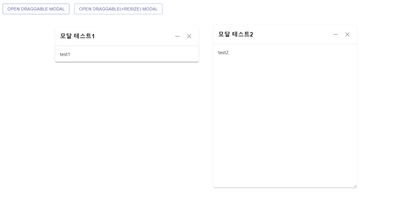
샘플 버튼을 구성 후 모달을 띄워본다.
import React, { useState } from 'react';
import { makeStyles } from '@material-ui/core/styles';
import Button from '@material-ui/core/Button';
import DraggableResizeModal from './components/common/DraggableResizeModal';

const useStyles = makeStyles((theme) => ({
    root: {
        '& > *': {
            margin: theme.spacing(1),
        },
        padding: theme.spacing(2)
    }
}));

function App() {
    const classes = useStyles();
    const [open ,setOpen] = useState(false);
    const [resizeOpen ,setResizeOpen] = useState(false);

    const handleOpenToggle = (evt) => {
        setOpen(!open)
    };

    const handleOpenResizeToggle = (evt) => {
        setResizeOpen(!resizeOpen);
    };

    return (
        <div className={classes.root}>
            <Button variant="outlined" color="primary" onClick={handleOpenToggle}>
                Open Draggable Modal
            </Button>
            <Button variant="outlined" color="primary" onClick={handleOpenResizeToggle}>
                Open Draggable(+resize) Modal
            </Button>
            <DraggableResizeModal
                title={'모달 테스트1'}
                open={open}
                width={450}
                height={450}
                onClose={handleOpenToggle}
            >
                test1
            </DraggableResizeModal>
            <DraggableResizeModal
                title={'모달 테스트2'}
                open={resizeOpen}
                isResize={true}
                width={450}
                height={450}
                onClose={handleOpenResizeToggle}
            >
                test2
            </DraggableResizeModal>
        </div>
    );
}

export default App;
※ 오타 수정이나 질문은 댓글로 부탁드립니다. 블로그 내용 및 소스는 마음껏 퍼가셔도 됩니다^^
전체소스: https://github.com/sbjang123456/react-draggable-resize-modal
sbjang123456/react-draggable-resize-modal
드래그 및 리사이즈 모달 컴포넌트. Contribute to sbjang123456/react-draggable-resize-modal development by creating an account on GitHub.
github.com
반응형
'React' 카테고리의 다른 글
| React + Redux 초기 셋팅 및 테스트 (1) | 2021.06.09 |
|---|---|
| React + Openlayers 구성 ( By React Context ) (0) | 2021.05.31 |
| [React] Keyboard 이벤트 (Enter Key 검색) (0) | 2021.05.21 |
| React 체크박스를 통한 배열 렌더링 및 Cleanup(with material-ui, notistack) (0) | 2021.05.18 |
| [React] react-router-dom 시작하기 (feat. material-dashboard) (0) | 2021.04.01 |


